目次
- 目次
- 検証環境
- 全般
- ウィンドウ
- UIパーツ(GUILayout)
- UIパーツ(EditorGUILayout)
- レイアウト関連
- スタイル
- 設定の保存
- EditorUtility
- その他Tips
- サンプルプロジェクト
- 関連記事
検証環境
- Unity 2022.3.23f1
全般
リファレンス
- GUI- Unity スクリプトリファレンス
- GUILayout - Unity スクリプトリファレンス
- EditorGUI - Unity スクリプトリファレンス
- EditorGUILayout - Unity スクリプトリファレンス
GUIのユーティリティクラスの概要は以下の記事を参照。
OnGUI
OnGUI: GUIイベントに応じて、フレームごとに複数回呼び出されます。レイアウトおよび再描画イベントが最初に処理され、その後にレイアウトおよびキーボード/マウスイベントが各入力イベントに対して処理されます。
「GUIイベントに応じて」とあるように、GUI関連のイベントが発生しないと呼び出されない。Updateのように毎フレーム必ず呼ばれるものではない。
イベント毎に1回呼び出されるため、OnGUIは1フレーム中に複数回呼び出される可能性がある。MonoBehaviourのenabledがfalseの時は呼ばれない。
ウィンドウ
ウィンドウを表示する
基本のテンプレート。
publicclassSampleWindow : EditorWindow
{
    [MenuItem("Tools/Sample Window")]
    staticvoid OpenWindow()
    {
        GetWindow<SampleWindow >("Title");
    }

    privatevoid Awake()
    {
        // 初期処理
    }

    privatevoid OnGUI()
    {
        // 画面構成と処理
    }
EditorWindowにShowXXXメソッドが定義されており、表示の仕方を選択できる。
ShowNotificationはウィンドウではないがついでに。
| メソッド | フレームタイプ | 表示位置 | サイズ | Modal | 自動Close |
|---|---|---|---|---|---|
| Show | タブ | 前回 | 前回 | ||
| ShowModal | ダイアログ | マウスカーソル | 前回 | o | |
| ShowModalUtility | ダイアログ | ディスプレイ左上 | 既定 | o | |
| ShowUtility | ダイアログ | 前回 | 前回 | ||
| ShowAuxWindow | ダイアログ | マウスカーソル | 前回 | 非アクティブ | |
| ShowAsDropDown | None | 指定必須 | 指定必須 | 非アクティブ | |
| ShowPopup | None | ディスプレイ左上 | 既定 | ||
| ShowNotification | オーバーレイ | Window中央やや下 | 5秒くらい |
「前回」は、前回のサイズや位置を記憶しているもの。
「ディスプレイ左上」「既定」となっているものは、おそらくpositionを指定することを前提としているが必須ではないもの。記憶もしていないので毎回指定する必要がある。
以下、Showから順に位置やサイズを指定しない場合の表示。


Show
var window = CreateInstance<ShowWindowSamplesWindow>();
        window.Show();
もしくは
GetWindow<ShowWindowSamplesWindow>("Show");
GetWindowする場合は内部で呼ばれるのでShowを呼び出す必要はない。
更にウィンドウのインスタンス管理がされているため、既に開いている場合はそのウィンドウがアクティブになる。CreateInstanceの方は複数開く。
位置やサイズの指定
var window = CreateInstance<ShowWindowSamplesWindow>();
        window.Show();
        window.minSize =new Vector2(100, 100);
        window.maxSize =new Vector2(1280, 960);
        // positionだけはShowの後じゃないと反映されない
        window.position =new Rect(20, 20, 400, 300);
positionは、前回の位置やサイズを記憶するウィンドウの場合Showした時に上書きされるため、Showより後に設定する必要がある。
ShowModal
ウィンドウを閉じるまで他の画面で操作不可能。
var window = CreateInstance<ShowWindowSamplesWindow>();
        window.ShowModal();
ShowModalUtility
ウィンドウを閉じるまで他の画面で操作不可能。ShowModalとは表示の位置やサイズなどに違いが見られる。
var window = CreateInstance<ShowWindowSamplesWindow>();
        // positionはShowModalUtilityの前
        window.position =new Rect(50, 50, 400, 300);
        window.ShowModalUtility();

前回の位置やサイズを記憶するウィンドウではないので、positionはShowModalUtilityより先に設定する必要がある。
位置はタイトルバーを除く要素の左上が起点となるため、yにディスプレイから見切れる値(0~タイトルバーなどの高さ)を設定した場合は、見きれない位置に調整される。
ShowUtility
ウィンドウを開いても他の画面を操作可能。ダイアログタイプなのでタブのドッキングなどはできない。
var window = CreateInstance<ShowWindowSamplesWindow>();
        window.ShowUtility();
ShowAuxWindow
他の画面をクリックするなど、ウィンドウ自体が非アクティブになると閉じる。
var window = CreateInstance<ShowWindowSamplesWindow>();
        window.ShowAuxWindow();
ShowAsDropDown
位置とサイズを指定してポップアップするフレームのないウィンドウ。他をクリックするなどウィンドウ自体が非アクティブになると閉じる。
private Rect dropDownButtonRect;

    privatevoid OnGUI()
    {
        if (GUILayout.Button("ShowAsDropDown"))
        {
            var popupPosition = GUIUtility.GUIToScreenPoint(dropDownButtonRect.center);
            var window = CreateInstance<PopupWindow>();
            window.ShowAsDropDown(new Rect(popupPosition, Vector2.zero), new Vector2(250, 150));
        }
        if (Event.current.type == EventType.Repaint)
            dropDownButtonRect = GUILayoutUtility.GetLastRect();
    }
GUILayoutUtility.GetLastRectについては後述。
ShowPopup
位置とサイズを指定してポップアップするフレームのないウィンドウ。非アクティブになっても閉じない。 タイトルバーもないため、明示的に閉じる処理を仕込む必要がある。
private Rect popupButtonRect;

    privatevoid OnGUI()
    {
        if (GUILayout.Button("ShowPopup"))
        {
            var popupPosition = GUIUtility.GUIToScreenPoint(popupButtonRect.center);
            var window = CreateInstance<PopupWindow>();
            window.position =new Rect(popupPosition, new Vector2(250, 150));
            window.ShowPopup();
        }
        if (Event.current.type == EventType.Repaint)
            popupButtonRect = GUILayoutUtility.GetLastRect();
    }
GUILayoutUtility.GetLastRectについては後述。

ShowNotification
ウィンドウにオーバーレイでメッセージを表示する。5秒程度で自動的に非表示になる。
privatevoid OnGUI()
    {
        if (GUILayout.Button("ShowNotification"))
        {
            ShowNotification(new GUIContent("ShowNotification"));
        }

        if (GUILayout.Button("Remove Notification"))
        {
            // 手動で消す場合
            RemoveNotification();
        }
    }
ウィンドウを閉じる
var window = GetWindow<SampleWindow >("Title");
    window.Close();
自分自身なら単にthis.Close();でOK。
既定のウィンドウを開く
var asm = Assembly.Load ("UnityEditor");
        var type = asm.GetType ("UnityEditor.BuildPlayerWindow");
        GetWindow(type);
UIパーツ(GUILayout)
Label
GUILayout.Label("Label");

TextField / TextArea / PasswordField
privatestring textField ="";
    privatestring textArea ="";
    privatestring password ="";

    void OnGUI()
    {
        textField = GUILayout.TextField(textField);

        textArea = GUILayout.TextArea(textArea);

        password = GUILayout.PasswordField(password, '*');
    }

TextFieldにフォーカスがある状態で内部の変数を更新(ボタンクリックなど)しても画面に反映されないことがある。
その場合はフォーカスを外してあげる必要がある。GUI.FocusControlは変数を更新する前でも後でも問題ない。
        GUI.FocusControl("");
        text ="new value";
Toggle
privatebool toggle =false;

    void OnGUI()
    {
        toggle = GUILayout.Toggle(toggle, "Toggle");
    }

Button / RepeatButton
RepeatButtonは、クリックしている間ずっとtrueを返す。
ただしOnGUIで処理する場合は、GUIイベント時にしか呼び出されないので毎フレーム呼ばれるわけではない。
if (GUILayout.Button("Button"))
            Debug.Log("Button clicked");

        if(GUILayout.RepeatButton("RepeatButton"))
            Debug.Log("RepeatButton clicking");

Toolbar
Toolbarは1行レイアウトの選択ボタン。選択したボタンのindexで判定する。
privateint toolbarSelected =0;

    void OnGUI()
    {
        toolbarSelected = GUILayout.Toolbar(toolbarSelected, new[] { "Toolbar1", "Toolbar2", "Toolbar3" });
    }

SelectionGrid
SelectionGridは複数行レイアウトの選択ボタン。選択したボタンのindexで判定する。
引数のxCountで列数を指定する。HorizontalScopeでもVertizalScopeでも配置が水平方向なのは変わらない。
privateint selGridSelected =0;

    void OnGUI()
    {
        selGridSelected = GUILayout.SelectionGrid(selGridSelected, new[] { "SelectionGrid1", "SelectionGrid2", "SelectionGrid3" }, 2);
    }
HorizontalSlider / VerticalSlider
引数は、leftValueとrightValue。
VerticalSliderはleftValueが上、rightValueが下。
privatefloat hSliderValue =0;
    privatefloat vSliderValue =0;

    void OnGUI()
    {
        hSliderValue = GUILayout.HorizontalSlider(hSliderValue, 0, 100, GUILayout.Height(20f));
        vSliderValue = GUILayout.VerticalSlider(vSliderValue, 100, 0, GUILayout.Height(50f));
    }

HorizontalScrollbar / VerticalScrollbar
HorizontalScrollbarの引数は、size、leftValue、rightValue。
sizeはスクロールボタンのサイズで、左右の値の差分に対する値で指定する。0~10でsizeが10なら目一杯のスクロールボタンになるためスクロールできない。
VerticalScrollbarの引数は、size、topValue、bottomValue。
topValueが先。
privatefloat hSbarValue =0;
    privatefloat vSbarValue =0;

    void OnGUI()
    {
        hSbarValue = GUILayout.HorizontalScrollbar(hSbarValue, 1, 0, 10);
        vSbarValue = GUILayout.VerticalScrollbar(vSbarValue, 1, 10, 0);
    }

UIパーツ(EditorGUILayout)
LabelField / SelectableLabel / PrefixLabel
SelectableLabel は選択可能なラベル。 PrefixLabelはクリックすると直後のコントロールにフォーカスが移動するラベル。
        EditorGUILayout.LabelField("Label");

        EditorGUILayout.SelectableLabel("SelectableLabel");

        EditorGUILayout.PrefixLabel("PrefixLabel");

TextField / DelayedTextField / TextArea / PasswordField
DelayedTextField は、Enterかフォーカスが外れるまで戻り値が変更されない入力コントロール。
privatestring textField ="";
    privatestring textArea ="";
    privatestring password ="";

    void OnGUI()
    {
        textField = EditorGUILayout.TextField(textField);

        textField = EditorGUILayout.DelayedTextField(textField);

        textArea = EditorGUILayout.TextArea(textArea);

        password = EditorGUILayout.PasswordField(password);
    }

Toggle / ToggleLeft
Toggleはラベルが左になる。ToggleLeftはトグルが左、ラベルが右になる。
privatebool toggle =false;

    void OnGUI()
    {
        toggle = EditorGUILayout.Toggle(toggle);
        toggle = EditorGUILayout.Toggle("ToggleRight", toggle);

        toggle = EditorGUILayout.ToggleLeft("ToggleLeft", toggle);
    }

ToggleGroupScope
配下のToggleを無効化する。チェックが付いている時に入力可能になる。
privatebool toggleGroup =false;
    privatebool toggle =false;

    void OnGUI()
    {
        using (var scope =new EditorGUILayout.ToggleGroupScope("Toggle Group Scope", toggleGroup))
        {
            toggleGroup = scope.enabled;
            toggle = EditorGUILayout.Toggle("Toggle", toggle);
            toggle = EditorGUILayout.Toggle("Toggle", toggle);
            toggle = EditorGUILayout.Toggle("Toggle", toggle);
        }
    }

FloatField / IntField / LongField / DoubleField
FloatField以外は省略。
privatefloat floatField =0;

    void OnGUI()
    {
        floatField = EditorGUILayout.FloatField(floatField);
    }

DelayedFloatField / DelayedIntField / DelayedDoubleField
Enterかフォーカスが外れるまで戻り値が変更されない入力コントロール。 DelayedFloatField以外は省略。
privatefloat floatField =0;

    void OnGUI()
    {
        floatField = EditorGUILayout.DelayedFloatField(floatField);
    }
ObjectField
第3引数はallowSceneObjects。
private Object objectField =null;

    void OnGUI()
    {
        objectField = EditorGUILayout.ObjectField(objectField, typeof(Object), true);
    }

LinkButton
if (EditorGUILayout.LinkButton("LinkButton"))
            Debug.Log("Button clicked");

Slider / IntSlider / MinMaxSlider
IntSlider以外はfloatを扱う。
privatefloat fSliderValue =0;
    privateint iSliderValue =0;
    privatefloat mmSliderMinLimit =-20;
    privatefloat mmSliderMaxLimit =20;
    privatefloat mmSliderMinValue =-10;
    privatefloat mmSliderMaxValue =10;

    void OnGUI()
    {
        fSliderValue = EditorGUILayout.Slider("Slider", fSliderValue, 0, 10);

        iSliderValue = EditorGUILayout.IntSlider("IntSlider", iSliderValue, 0, 10);

        EditorGUILayout.MinMaxSlider("MinMaxSlider", ref mmSliderMinValue, ref mmSliderMaxValue, mmSliderMinLimit, mmSliderMaxLimit);
    }

DisabledScope
引数disabledがtrueの時に配下のコントロールを操作不可にする。
privatebool disabled =true;

    void OnGUI()
    {
        using (new EditorGUI.DisabledScope(disabled))
        {
            EditorGUILayout.IntField("IntField", 0);
        }
    }

HelpBox
MessageType.None以外はアイコンが表示される。
引数wideがtrueの場合Windowの幅、falseの場合編集エリア(呼び方不明)の幅になる。
編集エリアはInspectorなどでラベルと編集のコントロールがセットになっている項目の編集側の領域を指す。
省略時はtrue。
        EditorGUILayout.HelpBox("HelpBox None", MessageType.None);
        EditorGUILayout.HelpBox("HelpBox Info", MessageType.Info);
        EditorGUILayout.HelpBox("HelpBox Warning", MessageType.Warning);
        EditorGUILayout.HelpBox("HelpBox Error", MessageType.Error);

        EditorGUILayout.Toggle("Toggle", true);
        EditorGUILayout.HelpBox("HelpBox Error", MessageType.Error, false);

その他
今回扱っていないもの。
// BoundsField// BoundsIntField// ColorField// CurveField// EnumFlagsField// GradientField// LayerField// MaskField// PropertyField// RectField// RectIntField// TagField// Vector2Field// Vector2IntField// Vector3Field// Vector3IntField// Vector4Field// DropdownButton// Popup// IntPopup// EnumPopup// InspectorTitlebar
レイアウト関連
スペース
GUILayoutにもEditorGUILayoutにも、Spaceは定義されている。
GUILayoutの引数はpixel、EditorGUILayoutの引数はwidth。若干違いがあるっぽいので別物?
using (new GUILayout.HorizontalScope())
        {
            GUILayout.Label("Label1");
            GUILayout.Space(20f);
            GUILayout.Label("Label2");
            GUILayout.Space(20f);
            GUILayout.Label("Label3");
        }
        using (new GUILayout.HorizontalScope())
        {
            GUILayout.Label("Label1");
            EditorGUILayout.Space(20f);
            GUILayout.Label("Label2");
            EditorGUILayout.Space(20f);
            GUILayout.Label("Label3");
        }

Box
テキスト、イメージ、それらを組み合わせたものなどを囲って表示できる。
LayoutOptionを指定しなければ中身にフィットする。
水平線(罫線)を引きたい時にも利用される。
            GUILayout.Box("Box");
            // 水平線
            GUILayout.Box("", GUILayout.Height(2), GUILayout.ExpandWidth(true));

垂直に配置する
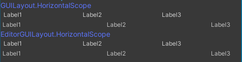
GUILayoutにもEditorGUILayoutにも、VerticalScopeは定義されている。動きは同じに見える。 Labelのスタイルは若干違うっぽい。
using (new GUILayout.VerticalScope())
        {
            GUILayout.Label("Label1");
            GUILayout.Label("Label2");
            GUILayout.Label("Label3");
        }
        using (new GUILayout.VerticalScope())
        {
            EditorGUILayout.LabelField("Label1");
            EditorGUILayout.LabelField("Label2");
            EditorGUILayout.LabelField("Label3");
        }
        using (new EditorGUILayout.VerticalScope())
        {
            GUILayout.Label("Label1");
            GUILayout.Label("Label2");
            GUILayout.Label("Label3");
        }
        using (new EditorGUILayout.VerticalScope())
        {
            EditorGUILayout.LabelField("Label1");
            EditorGUILayout.LabelField("Label2");
            EditorGUILayout.LabelField("Label3");
        }

水平に配置する
GUILayoutにもEditorGUILayoutにも、VerticalScopeは定義されている。動きは同じに見える。
EditorGUILayout.LabelFieldの方はMinWidthが設定されてるようで一定幅より小さくならない。
using (new GUILayout.HorizontalScope())
        {
            GUILayout.Label("Label1");
            GUILayout.Label("Label2");
            GUILayout.Label("Label3");
        }
        using (new GUILayout.HorizontalScope())
        {
            EditorGUILayout.LabelField("Label1");
            EditorGUILayout.LabelField("Label2");
            EditorGUILayout.LabelField("Label3");
        }
        using (new EditorGUILayout.HorizontalScope())
        {
            GUILayout.Label("Label1");
            GUILayout.Label("Label2");
            GUILayout.Label("Label3");
        }
        using (new EditorGUILayout.HorizontalScope())
        {
            EditorGUILayout.LabelField("Label1");
            EditorGUILayout.LabelField("Label2");
            EditorGUILayout.LabelField("Label3");
        }

一定幅より狭くなると見切れ始める。
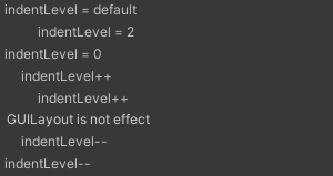
インデント
using (new EditorGUI.IndentLevelScope())
        {
            // 引数なしでindentLevel++と同じ、引数でレベルを指定できる、デフォルト(最上位)は0
            EditorGUILayout.LabelField("indentLevelScope");

            using (new EditorGUI.IndentLevelScope())
            {
                // 入れ子にするとさらにindentLevel++
                EditorGUILayout.LabelField("indentLevelScope");
            }
        }

usingを使わない以前の書き方。
GUILayout.Labelの方には影響しないみたい。
// デフォルトは0レベル
        EditorGUILayout.LabelField("indentLevel = default");
        EditorGUI.indentLevel =2;
        EditorGUILayout.LabelField("indentLevel = 2");
        EditorGUI.indentLevel =0;
        EditorGUILayout.LabelField("indentLevel = 0");

        // インクリメントでもインデントできる
        EditorGUI.indentLevel++;
        EditorGUILayout.LabelField("indentLevel++");
        EditorGUI.indentLevel++;
        EditorGUILayout.LabelField("indentLevel++");
        // GUILayoutには影響しない
        GUILayout.Label("GUILayout is not effect");
        EditorGUI.indentLevel--;
        EditorGUILayout.LabelField("indentLevel--");
        EditorGUI.indentLevel--;
        EditorGUILayout.LabelField("indentLevel--");
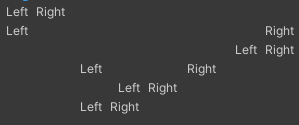
Alignment
GUILayout.FlexibleSpaceを利用する。FlexibleSpaceをいくつ、どこに置くか、で余白部分が自動で調整される。
using (new GUILayout.HorizontalScope())
        {
            // 左寄せ
            GUILayout.Label("Left");
            GUILayout.Label("Right");
            GUILayout.FlexibleSpace();
        }
        using (new GUILayout.HorizontalScope())
        {
            // 両端寄せ
            GUILayout.Label("Left");
            GUILayout.FlexibleSpace();
            GUILayout.Label("Right");
        }
        using (new GUILayout.HorizontalScope())
        {
            // 右寄せ
            GUILayout.FlexibleSpace();
            GUILayout.Label("Left");
            GUILayout.Label("Right");
        }
        using (new GUILayout.HorizontalScope())
        {
            // 等間隔
            GUILayout.FlexibleSpace();
            GUILayout.Label("Left");
            GUILayout.FlexibleSpace();
            GUILayout.Label("Right");
            GUILayout.FlexibleSpace();
        }
        using (new GUILayout.HorizontalScope())
        {
            // 中央寄せ
            GUILayout.FlexibleSpace();
            GUILayout.Label("Left");
            GUILayout.Label("Right");
            GUILayout.FlexibleSpace();
        }
        using (new GUILayout.HorizontalScope())
        {
            // 中央やや左寄せ
            GUILayout.FlexibleSpace();
            GUILayout.Label("Left");
            GUILayout.Label("Right");
            GUILayout.FlexibleSpace();
            GUILayout.FlexibleSpace();
        }
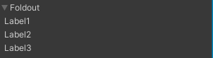
折りたたむ
折りたたまれるだけでインデントはつかない。
privatebool foldout =false;

    void OnGUI()
    {
        foldout = EditorGUILayout.Foldout(foldout, "Foldout");
        if (foldout)
        {
            GUILayout.Label("Label1");
            GUILayout.Label("Label2");
            GUILayout.Label("Label3");
        }
    }
スクロール
private Vector2 scrollPosScope = Vector2.zero;

    void OnGUI()
    {
        using (var scope =new EditorGUILayout.ScrollViewScope(scrollPosScope, GUILayout.Width(120f), GUILayout.Height(60f)))
        {
            // options でサイズや最大サイズ、最小サイズなどを指定できる
            scrollPosScope = scope.scrollPosition;
            GUILayout.Label("Label1");
            GUILayout.Label("Label2");
            GUILayout.Label("Label3");
            GUILayout.Label("Label4");
            GUILayout.Label("Label5");
        }
    }

Layout Option
        GUILayout.Box("Box 100x100", GUILayout.Width(100f), GUILayout.Height(100f));
        GUILayout.Box(
            "Once upon a time, there lived an old couple in a small village. One day the old wife was washing her clothes in the river when a huge peach came tumbling down the stream.",
            GUILayout.MinWidth(100f), GUILayout.MinHeight(100f), GUILayout.MaxWidth(200f), GUILayout.MaxHeight(100f));
        GUILayout.Box("Box ExpandWidth", GUILayout.ExpandWidth(true));
        GUILayout.Box("Box ExpandHeight", GUILayout.ExpandHeight(true));

Boxの場合、最小サイズに収まりきらない場合はテキストが見切れる。ExpandはWindowのサイズに応じて、自動レイアウトの余白部分で広がる。余白がなければ広がらない。

スタイル
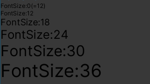
FontSize
LabelのデフォルトのFontSzieは12。GUIStyleの初期値の色は黒なので見えづらい。
        GUILayout.Label("FontSize:0(=12)", new GUIStyle{ fontSize =0 });
        GUILayout.Label("FontSize:12", new GUIStyle{ fontSize =12 });
        GUILayout.Label("FontSize:18", new GUIStyle{ fontSize =18 });
        GUILayout.Label("FontSize:24", new GUIStyle{ fontSize =24 });
        GUILayout.Label("FontSize:30", new GUIStyle{ fontSize =30 });
        GUILayout.Label("FontSize:36", new GUIStyle{ fontSize =36 });
FontStyle
        GUILayout.Label("FontStyle:Bold", new GUIStyle{ fontStyle = FontStyle.Bold });
        GUILayout.Label("FontStyle:Italic", new GUIStyle{ fontStyle = FontStyle.Italic });
        GUILayout.Label("FontStyle:BoldAndItalic", new GUIStyle{ fontStyle = FontStyle.BoldAndItalic });

Color
EditorStylesから既定のUIパーツで使われているスタイルを取得できる。
using (new GUILayout.HorizontalScope())
        {
            // Labelのデフォルト色は (0.769,0.769,0.769)
            GUILayout.Label("Label");
            GUILayout.Label("Label", new GUIStyle(EditorStyles.label));
            GUILayout.Label("Label", new GUIStyle { normal =new GUIStyleState { textColor =new Color(0.769f, 0.769f, 0.769f) } });
        }
using (new GUILayout.HorizontalScope())
        {
            GUILayout.Label("boldLabel", new GUIStyle(EditorStyles.boldLabel));
            GUILayout.Label("largeLabel", new GUIStyle(EditorStyles.largeLabel));
            GUILayout.Label("linkLabel", new GUIStyle(EditorStyles.linkLabel));
            GUILayout.Label("miniButton", new GUIStyle(EditorStyles.miniButton));
            GUILayout.Label("popup", new GUIStyle(EditorStyles.popup));
        }

スタイルだけなのでボタンやポップアップは動かない。マウスホーバーで色が変わるくらい。
using (new GUILayout.HorizontalScope())
        {
            // モノクロ
            GUILayout.Label("Label", new GUIStyle { normal =new GUIStyleState { textColor =new Color(0, 0, 0) } });
            GUILayout.Label("Label", new GUIStyle { normal =new GUIStyleState { textColor =new Color(0.25f, 0.25f, 0.25f) } });
            GUILayout.Label("Label", new GUIStyle { normal =new GUIStyleState { textColor =new Color(0.5f, 0.5f, 0.5f) } });
            GUILayout.Label("Label", new GUIStyle { normal =new GUIStyleState { textColor =new Color(0.75f, 0.75f, 0.75f) } });
            GUILayout.Label("Label", new GUIStyle { normal =new GUIStyleState { textColor =new Color(1, 1, 1) } });
        }

using (new GUILayout.HorizontalScope())
        {
            // 定義されたColor 1
            GUILayout.Label("Label", new GUIStyle { normal =new GUIStyleState { textColor = Color.black } });
            GUILayout.Label("Label", new GUIStyle { normal =new GUIStyleState { textColor = Color.grey } });
            GUILayout.Label("Label", new GUIStyle { normal =new GUIStyleState { textColor = Color.gray } });
            GUILayout.Label("Label", new GUIStyle { normal =new GUIStyleState { textColor = Color.clear } });
            GUILayout.Label("Label", new GUIStyle { normal =new GUIStyleState { textColor = Color.white } });
        }
        using (new GUILayout.HorizontalScope())
        {
            // 定義されたColor 2
            GUILayout.Label("Label", new GUIStyle { normal =new GUIStyleState { textColor = Color.red } });
            GUILayout.Label("Label", new GUIStyle { normal =new GUIStyleState { textColor = Color.green } });
            GUILayout.Label("Label", new GUIStyle { normal =new GUIStyleState { textColor = Color.blue } });
            GUILayout.Label("Label", new GUIStyle { normal =new GUIStyleState { textColor = Color.yellow } });
            GUILayout.Label("Label", new GUIStyle { normal =new GUIStyleState { textColor = Color.magenta } });
            GUILayout.Label("Label", new GUIStyle { normal =new GUIStyleState { textColor = Color.cyan } });
        }

greyとgrayは同じ色。
GUIStyle
GUIStyleが引数の場合、文字列でスタイル名を指定するとスタイルが適用される。
        GUILayout.Button("Button", "toolbarbutton");
        GUILayout.Button("Button", "ToolbarButtonFlat");
        GUILayout.Button("Button", "toolbarbuttonLeft");
        GUILayout.Button("Button", "toolbarbuttonRight");

GUI.skinに定義されたGUIStyleは以下の通り。
適用できるかどうかは試してみないとわからない。
量が多いので折りたたむ。
- AboutWIndowLicenseLabel
- AC BoldHeader
- AC Button
- AC ComponentButton
- AC GroupButton
- AC LeftArrow
- AC PreviewHeader
- AC PreviewText
- AC RightArrow
- AM ChannelStripHeaderStyle
- AM EffectName
- AM HeaderStyle
- AM MixerHeader
- AM MixerHeader2
- AM ToolbarLabel
- AM ToolbarObjectField
- AM TotalVuLabel
- AM VuValue
- AnimationEventBackground
- AnimationEventTooltip
- AnimationEventTooltipArrow
- AnimationKeyframeBackground
- AnimationPlayHead
- AnimationRowEven
- AnimationRowOdd
- AnimationSelectionTextField
- AnimationTimelineTick
- AnimClipToolbar
- AnimClipToolbarButton
- AnimClipToolbarPopup
- AnimItemBackground
- AnimLeftPaneSeparator
- AnimPlayToolbar
- AnimPropDropdown
- AppCommand
- AppCommandLeft
- AppCommandLeftOn
- AppCommandMid
- AppCommandRight
- AppToolbar
- AppToolbarButtonLeft
- AppToolbarButtonMid
- AppToolbarButtonRight
- ArrowNavigationLeft
- ArrowNavigationRight
- AssetLabel
- AssetLabel Icon
- AssetLabel Partial
- AvatarMappingBox
- AvatarMappingErrorLabel
- AxisLabelNumberField
- Badge
- BoldLabel
- BoldTextField
- BoldToggle
- BottomShadowInwards
- box
- BreadcrumbsSeparator
- button
- ButtonLeft
- ButtonMid
- ButtonRight
- BypassToggle
- CacheFolderLocation
- CenteredLabel
- ChannelStripAttenuationBar
- ChannelStripAttenuationMarkerSquare
- ChannelStripBg
- ChannelStripDuckingMarker
- ChannelStripEffectBar
- ChannelStripSendReturnBar
- ChannelStripVUMeterBg
- CircularToggle
- CN Box
- CN CenteredText
- CN CountBadge
- CN EntryBackEven
- CN EntryBackOdd
- CN EntryError
- CN EntryErrorIcon
- CN EntryErrorIconSmall
- CN EntryErrorSmall
- CN EntryInfo
- CN EntryInfoIcon
- CN EntryInfoIconSmall
- CN EntryInfoSmall
- CN EntryWarn
- CN EntryWarnIcon
- CN EntryWarnIconSmall
- CN EntryWarnSmall
- CN Message
- CN StacktraceBackground
- CN StacktraceStyle
- CN StatusError
- CN StatusInfo
- CN StatusWarn
- ColorField
- ColorPicker2DThumb
- ColorPickerBackground
- ColorPickerBox
- ColorPickerCurrentColor
- ColorPickerCurrentExposureSwatchBorder
- ColorPickerExposureSwatch
- ColorPickerHorizThumb
- ColorPickerHueRing
- ColorPickerHueRing HDR
- ColorPickerHueRingThumb
- ColorPickerOriginalColor
- ColorPickerSliderBackground
- Command
- CommandLeft
- CommandMid
- CommandRight
- ContentToolbar
- ControlHighlight
- ControlLabel
- CurveEditorBackground
- CurveEditorLabelTickmarks
- CurveEditorLabelTickmarksOverflow
- CurveEditorRightAlignedLabel
- DD Background
- DD HeaderStyle
- DD ItemCheckmark
- DD ItemStyle
- DD LargeItemStyle
- DefaultCenteredLargeText
- DefaultCenteredText
- DefaultLineSeparator
- dockarea
- dockareaOverlay
- dockareaStandalone
- dockHeader
- DopesheetBackground
- Dopesheetkeyframe
- DopesheetRippleLeft
- DopesheetRippleRight
- DopesheetScaleLeft
- DopesheetScaleRight
- dragtab
- dragtab first
- dragtab scroller next
- dragtab scroller prev
- dragtabdropwindow
- DropDown
- DropDownButton
- DropDownToggleButton
- DropzoneStyle
- EditModeSingleButton
- ErrorLabel
- ExposablePopupItem
- ExposablePopupMenu
- EyeDropperHorizontalLine
- EyeDropperPickedPixel
- EyeDropperVerticalLine
- FloatFieldLinkButton
- flow background
- flow node 0
- flow node 0 on
- flow node 1
- flow node 1 on
- flow node 2
- flow node 2 on
- flow node 3
- flow node 3 on
- flow node 4
- flow node 4 on
- flow node 5
- flow node 5 on
- flow node 6
- flow node 6 on
- flow node base
- flow node hex 0
- flow node hex 0 on
- flow node hex 1
- flow node hex 1 on
- flow node hex 2
- flow node hex 2 on
- flow node hex 3
- flow node hex 3 on
- flow node hex 4
- flow node hex 4 on
- flow node hex 5
- flow node hex 5 on
- flow node hex 6
- flow node hex 6 on
- flow node hex base
- flow node titlebar
- flow target in
- flow triggerPin in
- flow triggerPin out
- flow varPin in
- flow varPin out
- flow varPin tooltip
- Foldout
- FoldoutHeader
- FoldoutHeaderIcon
- FoldOutPreDrop
- Frame
- FrameBox
- GameViewBackground
- Grad Down Swatch
- Grad Down Swatch Overlay
- Grad Up Swatch
- Grad Up Swatch Overlay
- grey_border
- GridList
- GridListText
- GroupBox
- GUIEditor.BreadcrumbLeft
- GUIEditor.BreadcrumbLeftBackground
- GUIEditor.BreadcrumbMid
- GUIEditor.BreadcrumbMidBackground
- GV Gizmo DropDown
- HeaderButton
- HeaderLabel
- HelpBox
- Hi Label
- HorizontalMinMaxScrollbarThumb
- horizontalscrollbar
- horizontalscrollbarleftbutton
- horizontalscrollbarrightbutton
- horizontalscrollbarthumb
- horizontalslider
- horizontalsliderthumb
- HorizontalSliderThumbExtent
- hostview
- HoverHighlight
- IconButton
- IN BigTitle
- IN BigTitle Inner
- IN BigTitle Post
- IN CenteredLabel
- IN DropDown
- IN EditColliderButton
- IN Foldout
- IN Footer
- IN Label
- IN LockButton
- IN MinMaxStateDropDown
- IN ObjectField
- IN TextField
- IN ThumbnailSelection
- IN ThumbnailShadow
- IN Title
- IN Title Flat
- IN TitleText
- IN TypeSelection
- InnerShadowBg
- InsertionMarker
- InvisibleButton
- label
- LargeBoldLabel
- LargeButton
- LargeButtonLeft
- LargeButtonMid
- LargeButtonRight
- LargeLabel
- LightmapEditorSelectedHighlight
- LinkLabel
- LODBlackBox
- LODCameraLine
- LODLevelNotifyText
- LODRendererAddButton
- LODRendererButton
- LODRendererRemove
- LODRenderersText
- LODSceneText
- LODSliderBG
- LODSliderRange
- LODSliderRangeSelected
- LODSliderText
- LODSliderTextSelected
- MeBlendBackground
- MeBlendPosition
- MeBlendTriangleLeft
- MeBlendTriangleRight
- MeLivePlayBackground
- MeLivePlayBar
- MenuItem
- MenuItemMixed
- MenuToggleItem
- MeTimeBlockLeft
- MeTimeBlockRight
- MeTimeLabel
- MeTransitionBack
- MeTransitionBlock
- MeTransitionHandleLeft
- MeTransitionHandleLeftPrev
- MeTransitionHandleRight
- MeTransitionHead
- MeTransitionSelect
- MeTransitionSelectHead
- MeTransOff2On
- MeTransOffLeft
- MeTransOffRight
- MeTransOn2Off
- MeTransOnLeft
- MeTransOnRight
- MeTransPlayhead
- MiniBoldLabel
- minibutton
- minibuttonleft
- minibuttonmid
- minibuttonright
- MiniLabel
- MiniMinMaxSliderHorizontal
- MiniMinMaxSliderVertical
- MiniPopup
- MiniPullDown
- MiniSliderHorizontal
- MiniSliderVertical
- MiniTextField
- MiniToolbarButton
- MiniToolbarButtonLeft
- MinMaxHorizontalSliderThumb
- MultiColumnArrow
- MultiColumnHeader
- MultiColumnHeaderCenter
- MultiColumnHeaderRight
- MultiColumnTopBar
- MuteToggle
- NotificationBackground
- NotificationText
- ObjectField
- ObjectFieldButton
- ObjectFieldMiniThumb
- ObjectFieldThumb
- ObjectFieldThumbLightmapPreviewOverlay
- ObjectFieldThumbOverlay
- ObjectFieldThumbOverlay2
- ObjectPickerBackground
- ObjectPickerLargeStatus
- ObjectPickerPreviewBackground
- ObjectPickerResultsEven
- ObjectPickerResultsGrid
- ObjectPickerResultsOdd
- ObjectPickerSmallStatus
- ObjectPickerTab
- ObjectPickerToolbar
- OffsetDropDown
- OL box
- OL box flat
- OL box NoExpand
- OL EntryBackEven
- OL EntryBackOdd
- OL Label
- OL MiniPing
- OL MiniRenameField
- OL Minus
- OL Ping
- OL Plus
- OL ResultFocusMarker
- OL ResultLabel
- OL RightLabel
- OL SelectedRow
- OL Title
- OL Title TextRight
- OL Toggle
- OL ToggleMixed
- OL ToggleWhite
- OT BottomBar
- OT TopBar
- OverrideMargin
- PaneOptions
- PlayerSettingsLevel
- PlayerSettingsPlatform
- Popup
- PopupCurveDropdown
- PopupCurveEditorBackground
- PopupCurveEditorSwatch
- PopupCurveSwatchBackground
- PR BrokenPrefabLabel
- PR DisabledBrokenPrefabLabel
- PR DisabledLabel
- PR DisabledPrefabLabel
- PR Insertion
- PR Label
- PR Ping
- PR PrefabLabel
- PR TextField
- PreBackground
- PreBackgroundSolid
- PreButton
- PreButtonBlue
- PreButtonGreen
- PreButtonRed
- PreDropDown
- PreferencesKeysElement
- PreferencesSection
- PreferencesSectionBox
- PrefixLabel
- PreHorizontalScrollbar
- PreHorizontalScrollbarThumb
- PreLabel
- PreLabelUpper
- PreMiniLabel
- PreOverlayLabel
- PreSlider
- PreSliderThumb
- PreToolbar
- PreToolbar2
- PreVerticalScrollbar
- PreVerticalScrollbarThumb
- PreviewPackageInUse
- ProfilerBadge
- ProfilerDetailViewBackground
- ProfilerGraphBackground
- ProfilerHeaderLabel
- ProfilerLeftPane
- ProfilerNoDataAvailable
- ProfilerNotSupportedWarningLabel
- ProfilerPaneSubLabel
- ProfilerRightPane
- ProfilerScrollviewBackground
- ProfilerSelectedLabel
- ProfilerTimelineBar
- ProfilerTimelineDigDownArrow
- ProfilerTimelineFoldout
- ProfilerTimelineLeftPane
- ProfilerTimelineRollUpArrow
- ProgressBarBack
- ProgressBarBar
- ProgressBarText
- ProjectBrowserBottomBarBg
- ProjectBrowserGridLabel
- ProjectBrowserHeaderBgMiddle
- ProjectBrowserHeaderBgTop
- ProjectBrowserIconAreaBg
- ProjectBrowserIconDropShadow
- ProjectBrowserPreviewBg
- ProjectBrowserSubAssetBg
- ProjectBrowserSubAssetBgCloseEnded
- ProjectBrowserSubAssetBgDivider
- ProjectBrowserSubAssetBgMiddle
- ProjectBrowserSubAssetBgOpenEnded
- ProjectBrowserSubAssetExpandBtn
- ProjectBrowserSubAssetExpandBtnMedium
- ProjectBrowserSubAssetExpandBtnSmall
- ProjectBrowserTextureIconDropShadow
- ProjectBrowserTopBarBg
- QualitySettingsDefault
- quick search tab
- Radio
- RectangleToolHBar
- RectangleToolHBarLeft
- RectangleToolHBarRight
- RectangleToolHighlight
- RectangleToolRippleLeft
- RectangleToolRippleRight
- RectangleToolScaleBottom
- RectangleToolScaleLeft
- RectangleToolScaleRight
- RectangleToolScaleTop
- RectangleToolSelection
- RectangleToolVBar
- RectangleToolVBarBottom
- RectangleToolVBarTop
- RegionBg
- ReorderableList
- ReorderableListRightAligned
- RightAlignedLabel
- RightLabel
- RL Background
- RL DragHandle
- RL Element
- RL Empty Header
- RL Footer
- RL FooterButton
- RL Header
- SC ViewAxisLabel
- SC ViewLabel
- SC ViewLabelCentered
- SC ViewLabelLeftAligned
- SceneTopBarBg
- SceneViewOverlayTransparentBackground
- SceneVisibility
- ScriptText
- scrollview
- ScrollViewAlt
- SearchCancelButton
- SearchCancelButtonEmpty
- SearchModeFilter
- SearchTextField
- SelectionRect
- SettingsHeader
- SettingsIconButton
- SettingsListItem
- SettingsTreeItem
- ShurikenCheckMark
- ShurikenCheckMarkMixed
- ShurikenDropdown
- ShurikenEditableLabel
- ShurikenEffectBg
- ShurikenEmitterTitle
- ShurikenLabel
- ShurikenMinus
- ShurikenModuleBg
- ShurikenModuleTitle
- ShurikenObjectField
- ShurikenPlus
- ShurikenPopup
- ShurikenToggle
- ShurikenToggleMixed
- ShurikenValue
- SliderMixed
- SoloToggle
- StaticDropdown
- StatusBarIcon
- sv_iconselector_back
- sv_iconselector_button
- sv_iconselector_labelselection
- sv_iconselector_selection
- sv_iconselector_sep
- sv_label_0
- sv_label_1
- sv_label_2
- sv_label_3
- sv_label_4
- sv_label_5
- sv_label_6
- sv_label_7
- Tab first
- Tab last
- Tab middle
- Tab onlyOne
- TabWindowBackground
- Tag MenuItem
- TE BoxBackground
- TE DefaultTime
- TE DropField
- TE ElementBackground
- TE NodeBackground
- TE NodeBox
- TE NodeBoxSelected
- TE NodeLabelBot
- TE NodeLabelTop
- TE PinLabel
- TE Toolbar
- TE toolbarbutton
- TE ToolbarDropDown
- textarea
- textfield
- TextFieldDropDown
- TextFieldDropDownText
- TimeAreaToolbar
- TimeRulerBackground
- TimeScrubber
- TimeScrubberButton
- Titlebar Foldout
- TL InPoint
- TL OutPoint
- TL Playhead
- toggle
- ToggleMixed
- Toolbar
- ToolbarBoldLabel
- ToolbarBottom
- toolbarbutton
- ToolbarButtonFlat
- toolbarbuttonLeft
- toolbarbuttonRight
- ToolbarCreateAddNewDropDown
- ToolbarDropDown
- ToolbarDropDownLeft
- ToolbarDropDownRight
- ToolbarDropDownToggle
- ToolbarDropDownToggleButton
- ToolbarDropDownToggleRight
- ToolbarLabel
- ToolbarPopup
- ToolbarPopupLeft
- ToolbarPopupRight
- ToolbarSearchCancelButton
- ToolbarSearchCancelButtonEmpty
- ToolbarSearchCancelButtonWithJump
- ToolbarSearchCancelButtonWithJumpEmpty
- ToolbarSearchField
- ToolbarSearchTextField
- ToolbarSearchTextFieldJumpButton
- ToolbarSearchTextFieldPopup
- ToolbarSearchTextFieldWithJump
- ToolbarSearchTextFieldWithJumpPopup
- ToolbarSearchTextFieldWithJumpPopupSynced
- ToolbarSearchTextFieldWithJumpSynced
- ToolbarSlider
- ToolbarSliderTextField
- ToolbarTextField
- Tooltip
- TV Insertion
- TV InsertionRelativeToSibling
- TV Line
- TV LineBold
- TV Ping
- TV Selection
- U2D.createRect
- U2D.dragDot
- U2D.dragDotActive
- U2D.dragDotDimmed
- U2D.pivotDot
- U2D.pivotDotActive
- VerticalMinMaxScrollbarThumb
- verticalscrollbar
- verticalscrollbardownbutton
- verticalscrollbarthumb
- verticalscrollbarupbutton
- verticalslider
- verticalsliderthumb
- VerticalSliderThumbExtent
- VideoClipImporterLabel
- WarningOverlay
- WhiteBackground
- WhiteBoldLabel
- WhiteLabel
- WhiteLargeCenterLabel
- WhiteLargeLabel
- WhiteMiniLabel
- WinBtn
- WinBtnClose
- WinBtnCloseMac
- WinBtnInactiveMac
- WinBtnMax
- WinBtnMaxMac
- WinBtnMinMac
- WinBtnRestore
- WinBtnRestoreMac
- window
- WindowBottomResize
- Wizard Box
- Wizard Error
- WordWrapLabel
- wordwrapminibutton
- WordWrappedLabel
- WordWrappedMiniLabel
EditorStyles
GUIStyleのコンストラクタに渡すと既定のスタイルを引き継いだ新しいスタイルを生成できる。
var newStyle =new GUIStyle(EditorStyles.label));
EditorStylesに定義されたスタイルは以下の通り。
- Font
- boldFont
- miniBoldFont
- miniFont
- standardFont
- Control
- boldLabel
- centeredGreyMiniLabel
- colorField
- foldout
- foldoutHeader
- foldoutHeaderIcon
- foldoutPreDrop
- helpBox
- iconButton
- inspectorDefaultMargins
- inspectorFullWidthMargins
- label
- largeLabel
- layerMaskField
- linkLabel
- miniBoldLabel
- miniButton
- miniButtonLeft
- miniButtonMid
- miniButtonRight
- miniLabel
- miniPullDown
- miniTextField
- numberField
- objectField
- objectFieldMiniThumb
- objectFieldThumb
- popup
- radioButton
- selectionRect
- structHeadingLabel
- textArea
- textField
- toggle
- toggleGroup
- toolbar
- toolbarButton
- toolbarDropDown
- toolbarPopup
- toolbarSearchField
- toolbarTextField
- whiteBoldLabel
- whiteLabel
- whiteLargeLabel
- whiteMiniLabel
- wordWrappedLabel
- wordWrappedMiniLabel
HorizontalScope / VerticalScope にスタイルを適用する
HorizontalScope や VerticalScope の引数にGUIStyleを渡すことができるので、配下のコントロールをBox等で囲むことができる。
using (new GUILayout.HorizontalScope("Box"))
        {
            GUILayout.Label("Box1");
            GUILayout.Label("Box2");
            GUILayout.Label("Box3");
            GUILayout.Button("Box4");
        }
        using (new GUILayout.HorizontalScope("HelpBox"))
        {
            GUILayout.Label("HelpBox1");
            GUILayout.Label("HelpBox2");
            GUILayout.Label("HelpBox3");
            GUILayout.Button("HelpBox4");
        }

ラジオボタン
1行であればToolbar、複数行であればSelectionGridにEditorStyles.radioButtonを設定する。
        toolbarSelected = GUILayout.Toolbar(toolbarSelected, new[] { "Toolbar1", "Toolbar2", "Toolbar3" }, EditorStyles.radioButton);
        selGridSelected = GUILayout.SelectionGrid(selGridSelected, new[] { "SelectionGrid1", "SelectionGrid2", "SelectionGrid3" }, 2, EditorStyles.radioButton);

設定の保存
保存する
privatestring saveDataPath ="Assets/SamplesWindowData.asset";

    void Main()
    {
        var data = ScriptableObject.CreateInstance<SampleScriptableObject>();
        // dataを更新
        SaveData(data);
    }

    privatevoid SaveData(SampleScriptableObject data)
    {
        if (!AssetDatabase.Contains(data))
        {
            AssetDatabase.CreateAsset(data, saveDataPath );
        }

        data.hideFlags = HideFlags.NotEditable; // Inspectorから編集不可
        EditorUtility.SetDirty(data);
        AssetDatabase.SaveAssets();
        AssetDatabase.Refresh();
    }
読み込む
privatestring saveDataPath ="Assets/SamplesWindowData.asset";

    private SampleScriptableObject LoadData()
    {
        return AssetDatabase.LoadAssetAtPath<SampleScriptableObject >(saveDataPath );
    }
「No script asset for XXX. Check that the definition is in a file of the same name and that it compiles properly.」が発生した場合
ScriptableObjectのクラス名とファイル名が一致していない場合に発生する。
より詳細には、クラス名と同じ名前のファイルが存在していれば、クラスの定義がそのファイルに書かれていなくても警告がでなくなる。 しかし使い所は特になく、同じ名前のファイルが必要なことに変わりはないのでそこに定義しておけば良い。
No script asset for SampleScriptableObject. Check that the definition is in a file of the same name and that it compiles properly.
EditorUtility
EditorUtility - Unity スクリプトリファレンス
ダイアログ
if (GUILayout.Button("Dialog"))
            {
                // okならtrue, cancelならfalsevar result = EditorUtility.DisplayDialog("Title", "Message.", "OK Label", "Cancel Label");
                Debug.Log(result +" selected.");
            }
            if (GUILayout.Button("DialogComplex"))
            {
                // okなら0, cancelなら1, altなら2var result = EditorUtility.DisplayDialogComplex("Title", "Message.", "OK Label", "Cancel Label", "3rd button");
                Debug.Log(result +" selected.");
            }


フォルダ選択ダイアログ
privatestring selectedPath;

    private OnGUI()
    {
        if (GUILayout.Button("FolderPanel", GUILayout.Width(100f)))
        {
            selectedPath = EditorUtility.OpenFolderPanel("Target folder", Application.dataPath, string.Empty);
        }
    }

ファイル選択ダイアログ
privatestring selectedPath;

    private OnGUI()
    {
            if (GUILayout.Button("FilePanel", GUILayout.Width(100f)))
            {
                selectedPath = EditorUtility.OpenFilePanel("Target file", Application.dataPath, string.Empty);
            }
            if (GUILayout.Button("FilePanelWithFilters", GUILayout.Width(150f)))
            {
                selectedPath = EditorUtility.OpenFilePanelWithFilters("Target file", Application.dataPath, new []{ "Image files", "png,jpg,jpeg", "All files", "*" });
            }
    }

第3引数で拡張子を指定できる。Emptyの場合は「All files」。

複数指定する場合は、OpenFilePanelWithFiltersの方を使う。

フォルダ保存ダイアログ
フォルダ選択と同じ。
privatestring selectedPath;

    private OnGUI()
    {
        if (GUILayout.Button("FolderPanel", GUILayout.Width(100f)))
        {
                selectedPath = EditorUtility.SaveFolderPanel("Target folder", Application.dataPath, string.Empty);
        }
    }
ファイル保存ダイアログ
privatestring selectedPath;

    private OnGUI()
    {
            if (GUILayout.Button("FilePanel", GUILayout.Width(100f)))
            {
                selectedPath = EditorUtility.SaveFilePanel("Target file", Application.dataPath, "Default name", "txt");
            }
            if (GUILayout.Button("FilePanelInProject", GUILayout.Width(150f)))
            {
                selectedPath = EditorUtility.SaveFilePanelInProject("Target file", "DefaultName", "txt", "message");
            }
    }
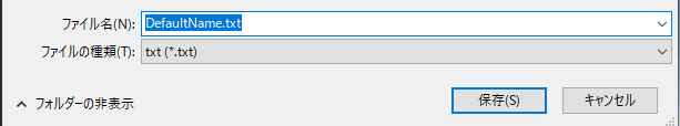

SaveFilePanelInProjectを使用するとAssets/からの相対パスで取得できる。
Windowsだと残念ながらmessageは表示されない。

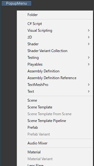
PopupMenu
Projectウィンドウの右クリックメニューと同じようなことができる。
menuItemPathで表示するメニューのパスを指定する。
private Rect popupButtonRect;

    private OnGUI()
    {
        if (GUILayout.Button("PopupMenu", GUILayout.Width(100f)))
        {
            var popupPosition = GUIUtility.GUIToScreenPoint(popupButtonRect.center);
            EditorUtility.DisplayPopupMenu(new Rect(popupPosition, Vector2.zero), "Assets/Create", null);
        }
        if (Event.current.type == EventType.Repaint)
            popupButtonRect = GUILayoutUtility.GetLastRect();
    }
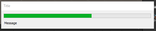
プログレスバー
終了後に必ずClearProgressBarを呼ばないとプログレスバーが消えないため、使う時は try ~ finallyなどの対策が必要。
privateint guiEventCount =-1;
    privatebool cancelablePBar;

    private OnGUI()
    {
        if (guiEventCount is>= 0 and <=20)
        {
            if (cancelablePBar)
                EditorUtility.DisplayCancelableProgressBar("Title", "Message", (float)guiEventCount /20);
            else
                EditorUtility.DisplayProgressBar("Title", "Message", (float)guiEventCount /20);

            guiEventCount++;
        }
        elseif (guiEventCount >20)
        {
            EditorUtility.ClearProgressBar();
            guiEventCount =-1;
        }
        else
        {
            if (GUILayout.Button("Progressbar"))
            {
                guiEventCount =0;
                cancelablePBar =false;
            }
            if (GUILayout.Button("CancelableProgressBar"))
            {
                guiEventCount =0;
                cancelablePBar =true;
            }
        }
    }

その他Tips
OnGUIを毎フレーム実行する
Repaintを呼び出すとGUIイベントが発生するので、OnGUIを強制的に呼び出すことができる。
void Update()
    {
        Repaint();
    }
マウスの座標を取得する
Repaintで毎フレーム実行して、Event.current.mousePositionを取得する。
取得できる座標は、ウィンドウの左上(0, 0)を起点とした相対座標になる。
void Update()
    {
        Repaint();
    }
    void OnGUI()
    {
        GUILayout.Label(Event.current.mousePosition.ToString());
    }
コントロールの位置とサイズを取得する
GUILayoutUtility.GetLastRectを使うと直前のコントロールのRectを取得できる。
Repaintイベント時にしか使えないので判定を入れておく必要がある。
        GUILayout.Button("Target control");
        if (Event.current.type == EventType.Repaint)
            Debug.Log(GUILayoutUtility.GetLastRect().ToString());